
Beginner’s Guide to Exploratory Data Analysis and Feature Engineering
Introduction
Exploratory data analysis (EDA) is an approach to analyzing data sets to summarize their main characteristics, often with visual methods. A statistical model can be used or not, but primarily EDA is for seeing what the data can tell us beyond the formal modeling or hypothesis testing task. When I started my journey in the Data Science field I always had difficulty with the starting point of any problem but after reading a few exemplary Kernels in Kaggle I have realized the power of Exploratory Data Analysis and its impact on Data Modeling and Predictions
I am trying to explain how we can do EDA and Feature Engineering as the simplest way to get some insight into the Titanic Disaster. I have put only specific code snippets before each visualization and analysis, if anyone is interested in full code then refer to the link provided at the end.
The sinking of the Titanic is one of the most infamous shipwrecks in history. On April 15, 1912, during her maiden voyage, the widely considered “unsinkable” RMS Titanic sank after colliding with an iceberg. Unfortunately, there weren’t enough lifeboats for everyone on board, resulting in the death of 1502 out of 2224 passengers and crew.
I have used dataset which is provided by Kaggle for Titanic: Machine Learning from Disaster Competition
Features Analysis
Let’s import required libraries for EDA
#Importing required libraries
import numpy as np
import seaborn as sns
import pandas as pd
import matplotlib.pyplot as plt
import plotly.graph_objects as go
import plotly.express as px
from sklearn.ensemble import RandomForestClassifier
#Importing train data set
ds_train=pd.read_csv("/<InputDirectory>/train.csv")
#Checking features in train data set
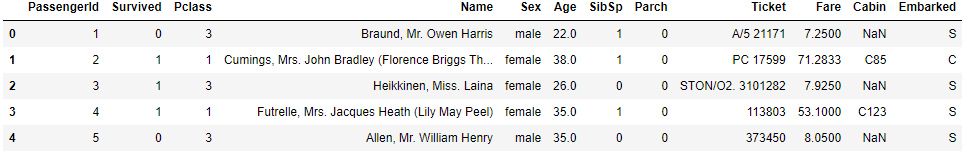
ds_train.head()
Now , analyze these features/variables one by one
Survived is a target variable where the survival of a passenger is predicted in binary format i.e. 0 for Not Survived and 1 for Survived
PassengerId and Ticket variables can be assumed as Random unique Identifiers of Passengers and they don’t have any impact on survival, hence we can ignore them
Pclass is an ordinal datatype for the ticket class, it can be considered as the passenger’s Socio-Economic Status and it may impact the passenger’s survival chances so we will keep this in our analysis. It’s unique values are 1 = Upper Class, 2 = Middle Class and 3= Lower Class
Name is self-explanatory, we will skip this variable from our analysis
Sex or Gender could have played an important role in survival because during any evacuation from disaster, preference will be given to the female gender and to test this notion we will consider gender in our analysis
SibSp and Parch represent the total number of the passenger’s siblings/spouse and parents/children on board respectively, they could be used to create a new variable called ‘Family Size’ (Creating a new feature/variable is an example of Feature Engineering)
Age could have also played a role in survival, so we will keep this in our feature list
Fare is also an indicator of the Socio-Economic Status of passengers, let’s keep this in our feature list
Cabin is the Cabin number of the passenger and it can be used in Feature engineering to get an approximate position of the passenger when the accident happened, also from deck level, we can deduce Socioeconomic status. However, after looking at the data it looks like there are many null values so we can drop this column from our feature list.
Embarked is a port of embarkation of passengers and this may have an impact on the target variable so we will keep this variable for now. It has 3 unique values , C = Cherbourg ,Q = Queenstown and S = Southampton
Visualization
Now, we will try to see the relation between selected features by creating Seaborn and Plotly visualization
First, start with the passenger’s Age
#Converting Age into series and visualizing the age distribution
age_series=pd.Series(ds_train['Age'].value_counts())
fig=px.scatter(age_series,y=age_series.values,x=age_series.index)
fig.update_layout(
    title="Age Distribution",
    xaxis_title="Age in Years",
    yaxis_title="Count of People",
    font=dict(
        family="Courier New, monospace",
        size=18,
    )
)
fig.show()
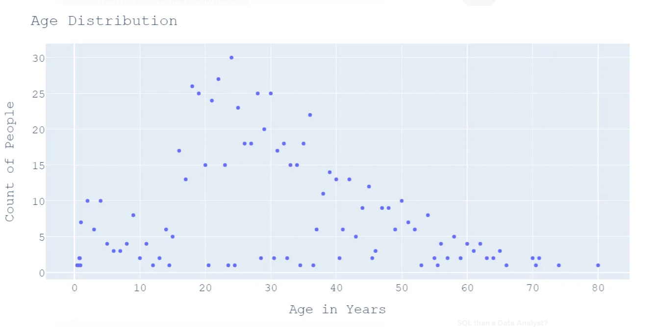
We can deduce a few points from the above graph
- Majority of passengers aged more than 20 years and less than 50 years
- 30 passengers share the same age i.e. 24 years
- 164 passengers share the same age
Let’s check how Gender is distributed among passengers
print("Number of Passengers Gender Wise \n{}".format(ds_train['Sex'].value_counts()))
#Gender wise distribution
fig = go.Figure(data=[go.Pie(labels=ds_train['Sex'],hole=.4)])
fig.update_layout(
    title="Sex Distribution",
    font=dict(
        family="Courier New, monospace",
        size=18
    ))
fig.show()
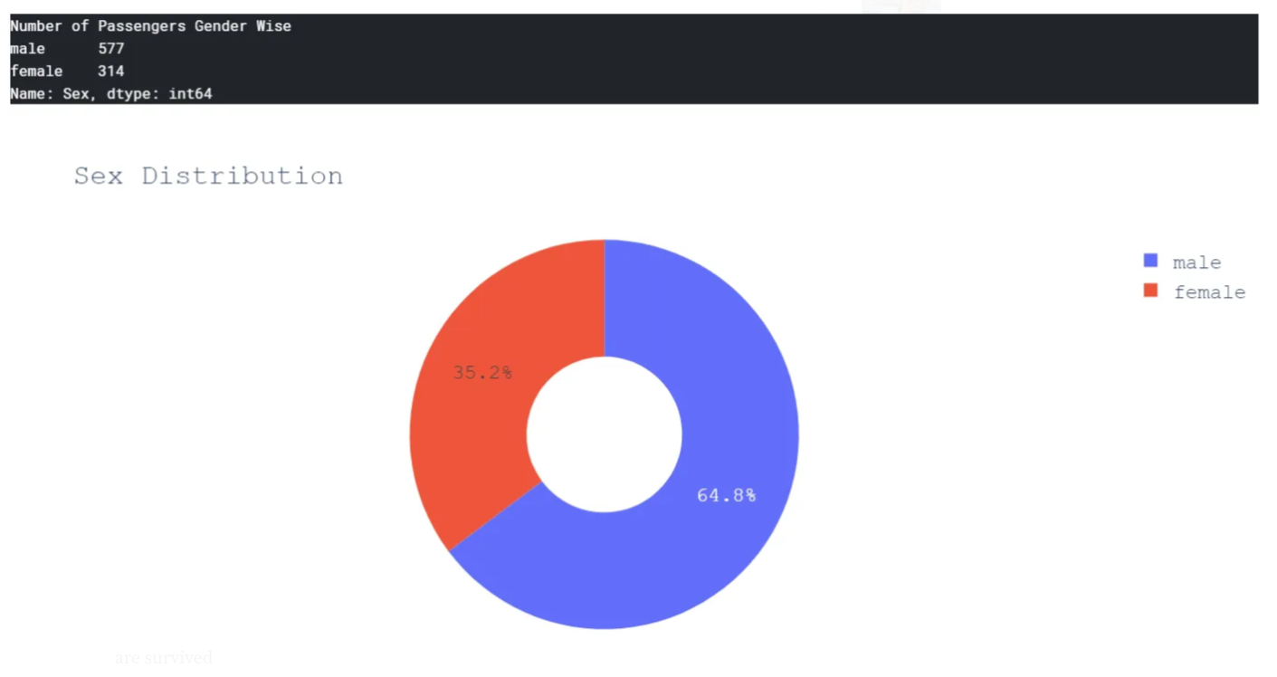
It’s quite evident that the number of male passengers is almost double of female passengers.
Let’s see how many females and males survived across different age groups.
#Create categorical variable graph for Age,Sex and Survived variables
sns.catplot(x="Survived", y="Age", hue="Sex", kind="swarm", data=ds_train,height=10,aspect=1.5)
plt.title('Passengers Survival Distribution: Age and Sex',size=25)
plt.show()
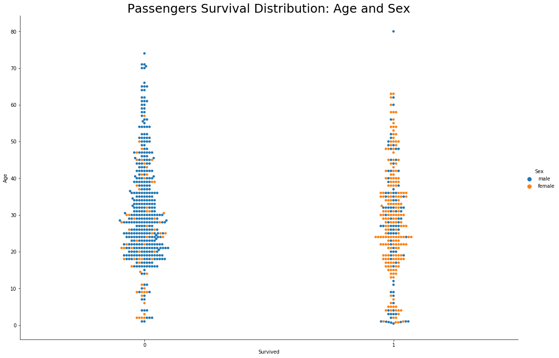
Well it’s pretty evident from the above graph that the majority of female passengers are survived
- Majority of Male passengers aged between 20 to 50 years had not survived. It means most of the young men had not survived this disaster
- Oldest male passenger aged 80 years,had survived
- Age and Sex were major factors in deciding the passenger’s fate
Now, let’s see Pclass variable relation with survival
#Visualize relation between Pclass and Survival
fig = go.Figure(data=[go.Pie(labels=ds_train['Pclass'],hole=.4)])
fig.update_layout(
    title="PClass Distribution",
    font=dict(
        family="Courier New, monospace",
        size=18
    ))
fig.show()
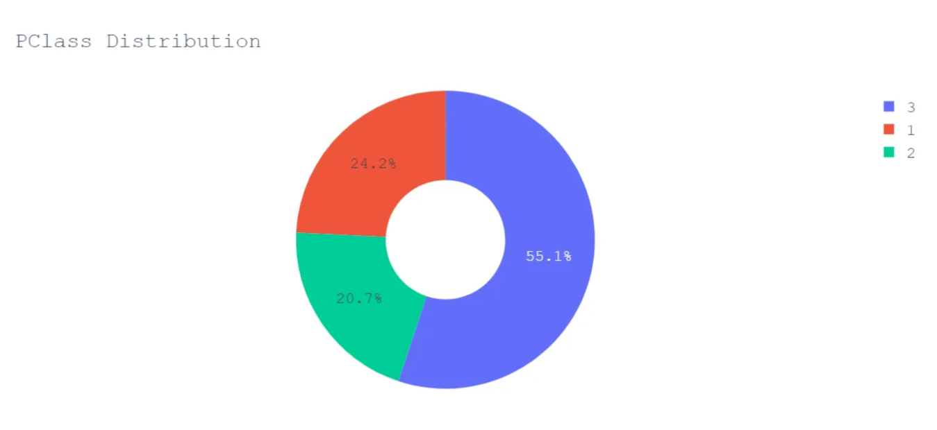
More than half of the passengers were traveling in Lower Class.
Let’s see how survival is linked with Pclass
#Visualize PClass and Survival
#Create categorical variable graph for Age,Pclass and Survived variables
sns.catplot(x="Survived", y="Age", hue="Pclass", kind="swarm", data=ds_train,height=10,aspect=1.5)
plt.title('Passengers Survival Distribution: Age and Pclass',size=25)
plt.show()
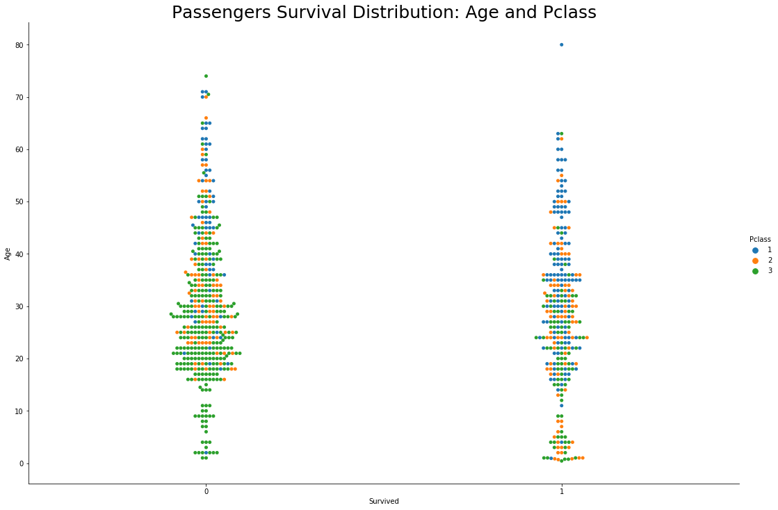
- Again , majority of young male passengers aged between 20 to 50 years and travelling in lower class had not survived</b>
- Oldest male passenger who survived the disaster was travelling in upper class
- Young men who survived the disaster were travelling in upper class
If the passenger was a man aged between 20–50 years, and not so rich at the time of travel then their chances of survival were very less
To support our Socio-Economic Status theory let’s focus on one more variable Fare
#Visualize Fare and Survival
#Create categorical variable graph for Sex,Fare and Survived variables
sns.catplot(x="Survived", y="Fare", hue="Sex", kind="swarm", data=ds_train,height=10,aspect=1.5)
plt.title('Passengers Survival Distribution: Fare and Sex',size=25)
plt.show()
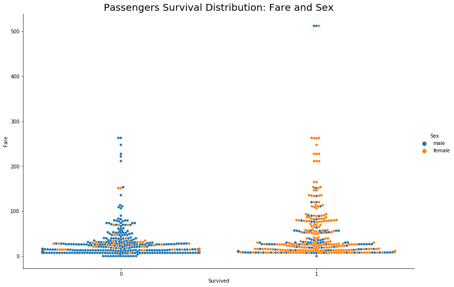
In the above graph, for the feature ‘Sex’ consider 1 for females and 0 for males. It’s evident that female passengers with lower ticket fares survived the disaster and a few male passengers with the highest fare also survived.
It means when it comes to gender, the female got preference across all the classes otherwise Socio-Economic Status played an important role in survival.
Now, we will see Embarked variable’s impact on survival
#Visualize relation between Embarked and Survival
fig = go.Figure(data=[go.Pie(labels=ds_train['Embarked'],hole=.4)])
fig.update_layout(
    title="Embarked Distribution",
    font=dict(
        family="Courier New, monospace",
        size=18
    ))
fig.show()
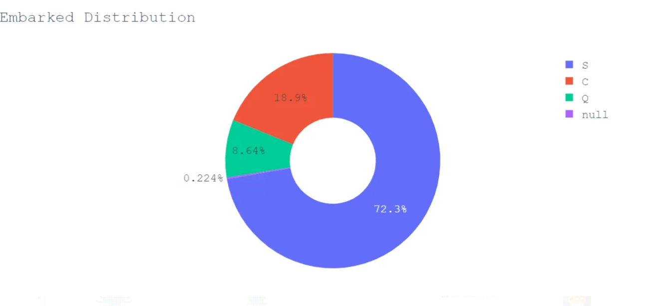
The majority of passengers embarked from Southampton, let’s visualize its survival distribution.
#Visualize Embarked and Survival
#Create categorical variable graph for Embarked,Age and Survived variables
sns.catplot(x="Survived", y="Age", hue="Embarked", kind="swarm", data=ds_train,height=10,aspect=1.5)
plt.title('Passengers Survival Distribution: Embarked and Age',size=25)
plt.show()
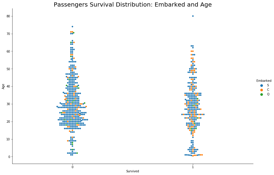
We can not deduce any direct relation between Embarked and Survival.
Let’s check the correlation coefficient between these features
# Training set high correlations
ds_train.corr()
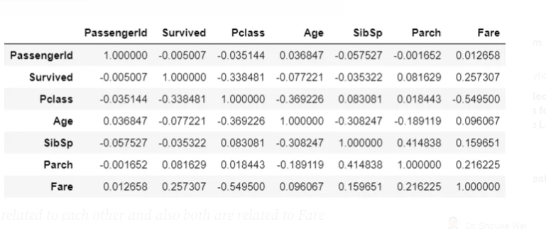
We can see a direct correlation between the ‘Survived’ and ‘Fare’ variables, other variables are in-directly related to Survival
- Age is correlated to Fare and Fare is correlated to Survived and our analysis also shows how Age played a role in survival, by this we can say that Age is related to Survival
- SibSp and Parch are related to each other and also both are related to Fare which makes sense because more people means more fare, by virtue of this both can be related to Survived
Feature Engineering
Feature engineering is the process of using domain knowledge to extract features from raw data via data mining techniques. These features can be used to improve the performance of machine learning algorithms. Having and engineering good features will allow you to most accurately represent the underlying structure of the data and therefore create the best model.
Features can be engineered by decomposing or splitting features, from external data sources, or aggregating or combining features to create new features.
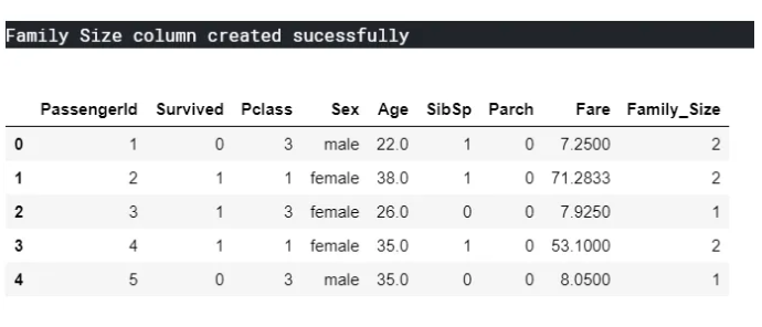
Let’s start Feature Engineering by creating a new variable Family Size by adding SibSp, Parch, and One(Current Passenger)
#Add new column 'Family Size' in training model set
ds_train['Family_Size'] = ds_train['SibSp'] + ds_train['Parch'] + 1
print("Family Size column created sucessfully")
ds_train.head()
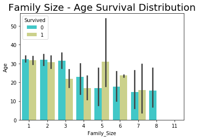
Now we will see how the Family size will is related to Survived variable
#Visualize Family size and Survival
sns.barplot(x="Family_Size", y="Age", hue="Survived", data=ds_train,palette = 'rainbow')
plt.title('Family Size - Age Survival Distribution',size=20)
plt.show()
sns.catplot(y="Family_Size", x="Survived", hue='Sex',kind="swarm", data=ds_train,height=8,aspect=1.5)
plt.title('Family Size - Gender Survival Distribution',size=25)
plt.show()
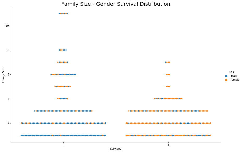
- Chances of survival are less for large Families (>5 members)
- If the family size is small then the main passenger’s gender decides on survival, this supports the previous deduction of Gender’s role in the survival
Note: Survival data is marked for main passengers and not for the whole family, whereas family members’ names must be there in the list and they may or may not be survived. In other words, by just looking at the survival column we can not deduce that the fate of all family members was the same
Last Word
We can see that by just visualizing the relation between a few variables we got so many insights and further we can use this newly gained knowledge regarding a feature in training data models by adding new features and removing the unnecessary ones.
Refer to Kaggle Kernel or Juypter Notebook for whole analysis and data modeling
Disclaimer: Just to let you know, this blog post was originally published on Medium. If you’d like to check out the original, you can find it at this link.

Leave a comment