
COVID-19-Insights with Data Visualization
Introduction
As COVID-19 is wreaking havoc, every Data Scientist is trying to get some insights from related data. In this post, I am also attempting to get answers to the following questions with the help of Data Visualization.
What we can learn from countries like China, South Korea, and Italy the most impacted countries
What is the current state in countries where it started late, like India and US, and what could be the possible future state in these two countries
The intent is to get basic insights without complex graphs and code and to keep things simple and easy to understand I have used only Plotly Scatter and Bar graphs.
This is the summary of my Kaggle notebook in which I have explored the COVID-19 data set provided by John Hopkins University. In case interested in more detailed code and explanation please refer to this notebook, where data is getting updated on daily basis.
How China, Italy, and South Korea are impacted
Let’s start analyzing the situation in China first
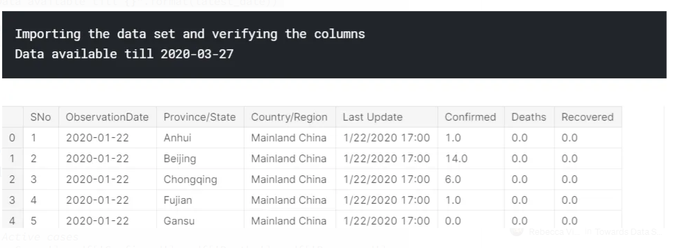
#import main data set
df=pd.read_csv('../input/novel-corona-virus-2019-dataset/covid_19_data.csv')
print("Importing the data set and verifying the columns")

#Converting date column into correct format
df['ObservationDate']=pd.to_datetime(df['ObservationDate'])

#Geting latest timestamp
latest_timestamp=df.iloc[df.last_valid_index()]['ObservationDate']
#Geting latest date
latest_date=latest_timestamp.strftime("%Y-%m-%d")
print("Data available till {}".format(latest_date))

#Checking Columns in data set
df.head()
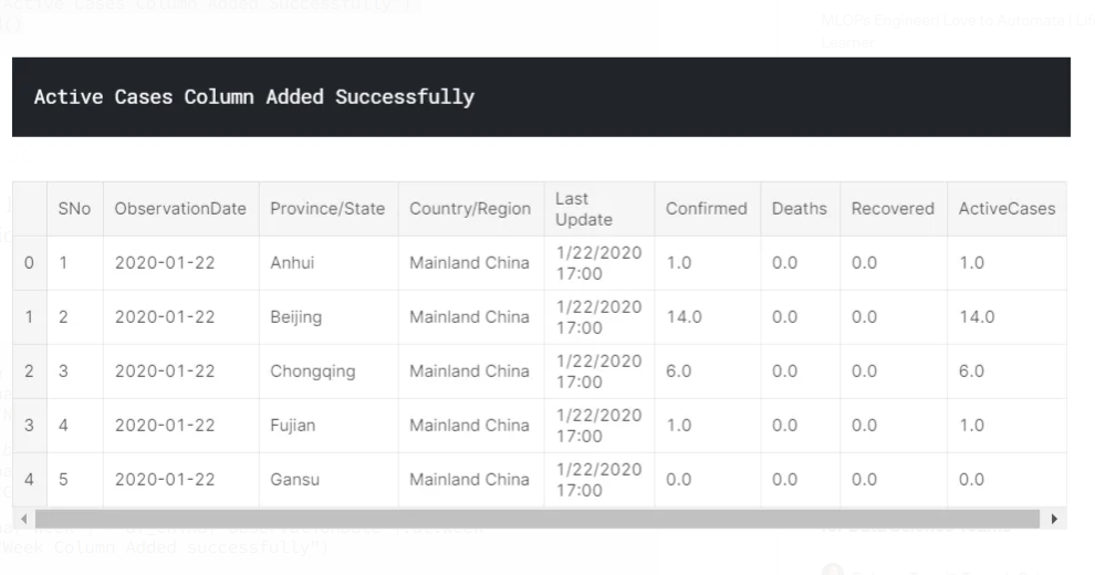
Let’s add one more column here, Active Cases (Confirmed Cases-Recovered-Deaths)
#Adding Active cases
df['ActiveCases'] = df['Confirmed'] - df['Deaths'] - df['Recovered']
print("Active Cases Column Added Successfully")
df.head()
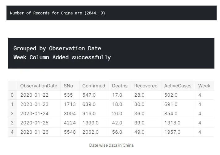
As data is present across provinces in China, we will group the data by Observation Date and add one more column ‘Week’ to see the trend across the weeks
#Taking out of data for China region
df_china=df[df['Country/Region'] == 'Mainland China']
print("Number of Records for China are {}".format(df_china.shape))

#Group by date
df_china=df_china.groupby(['ObservationDate']).sum().reset_index()
print("Grouped by Observation Date")
df_china['Week'] = df_china['ObservationDate'].dt.week
print("Week Column Added successfully")
df_china.head()
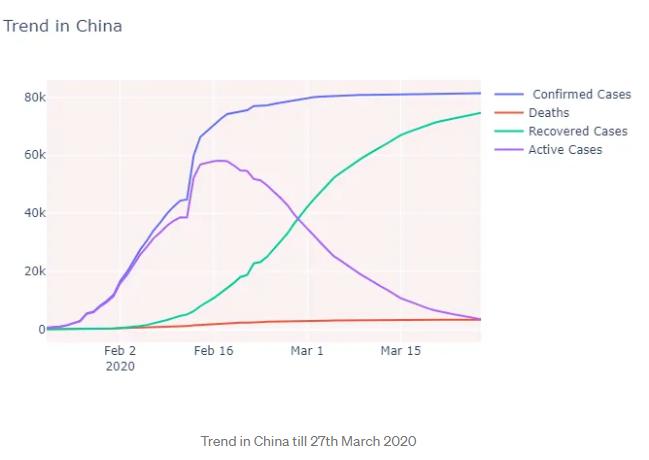
Let’s visualize the trend and latest status in China
#Visualizing the trends
fig = go.Figure()
fig.add_trace(go.Scatter(x=df_china['ObservationDate'], y=df_china['Confirmed'],
                    mode='lines',name=' Confirmed Cases'))
fig.add_trace(go.Scatter(x=df_china['ObservationDate'], y=df_china['Deaths'],
                mode='lines',name='Deaths'))
fig.add_trace(go.Scatter(x=df_china['ObservationDate'], y=df_china['Recovered'],
                mode='lines',name='Recovered Cases'))
fig.add_trace(go.Scatter(x=df_china['ObservationDate'], y=df_china['ActiveCases'],
                mode='lines',name='Active Cases'))

fig.update_layout(title_text='Trend in China',plot_bgcolor='rgb(250, 242, 242)')

fig.show()
#Getting the latest observation date from data set
df.iloc[df.last_valid_index()]['ObservationDate']
#Taking out record for latest records in separate data frame
df_china_lately=df_china[df_china['ObservationDate'] == latest_date]
#Creating temporary data frame for visualizing purpose
df_china_status=pd.DataFrame(columns=['Numbers','Status'])
#Appending Records from latest data frame
df_china_status=df_china_status.append({'Numbers':df_china_lately.iloc[0]['Confirmed'],'Status':'Confirmed'},ignore_index=True)
df_china_status=df_china_status.append({'Numbers':df_china_lately.iloc[0]['ActiveCases'],'Status':'Active Cases'},ignore_index=True)
df_china_status=df_china_status.append({'Numbers':df_china_lately.iloc[0]['Recovered'],'Status':'Recovered'},ignore_index=True)
df_china_status=df_china_status.append({'Numbers':df_china_lately.iloc[0]['Deaths'],'Status':'Deaths'},ignore_index=True)
#Visualizing graphs
fig = px.bar(df_china_status, y='Numbers', x='Status',title='Latest Status in China' , color='Numbers')
fig.show()
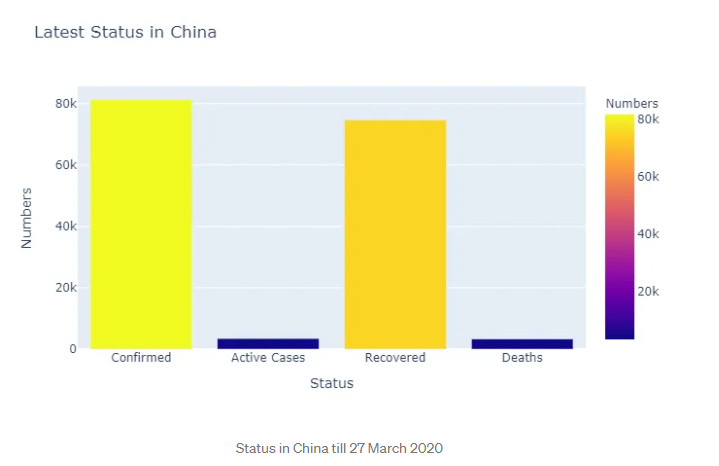
- The number of confirmed cases surged in January last week and mid of February but from March's first week there is no sudden rise in confirmed cases, it’s kind of stable after that
- The number of Deaths is increasing throughout the month of Feb and March, it keep on increasing when the number of confirmed cases are not increasing much this may be because previously confirmed cases were not able to recover
- The number of recoveries is pretty good, from February last week there is a sudden rise in recovered cases and that’s why active cases are very less. China did a pretty good job of fighting back
#Calculating Death,Active Cases and Recovery percentage
death_percentage=round((df_china_lately.iloc[0]['Deaths']/df_china_lately.iloc[0]['Confirmed'])*100)
active_cases_percentage=round((df_china_lately.iloc[0]['ActiveCases']/df_china_lately.iloc[0]['Confirmed'])*100)
recovery_percentage=round((df_china_lately.iloc[0]['Recovered']/df_china_lately.iloc[0]['Confirmed'])*100)

print("In China Active Cases and Recovery percentage is {} ,{} respectively and Death rate is {} ".format(active_cases_percentage,recovery_percentage,death_percentage))
The rate of Active and Recovered Cases are 4% and 92% respectively and the Death rate is also 4% in China till 27th March 2020
Well, this is a tremendous comeback for China. After seeing a rapid surge in confirmed cases Chinese government was able to control this pandemic in a short period. They are following an ideal graph for Active and Recovered cases, any country that is fighting COVID-19 should exhibit one of these characteristics,
Let’s start looking at the trend in Italy
Note: I will not mention code for other countries as the codes are identical
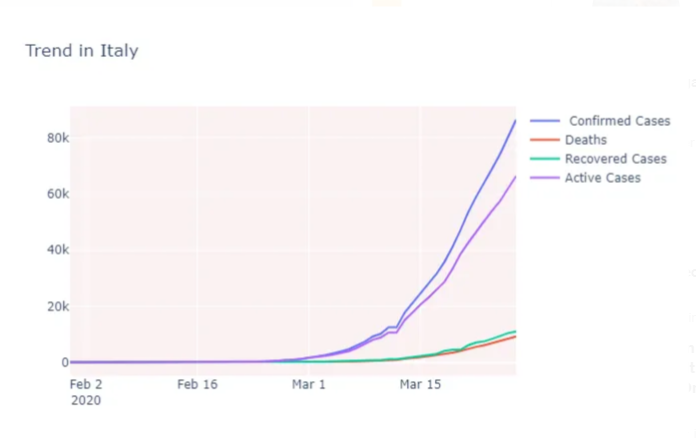
- There is a sudden surge in confirmed cases in and after the first week of March
- The rate by which confirmed cases are increasing is way higher than the rate of recovery and deaths, which is not the case in China
- Within 10 days (between 12th-21st March) death tolls increased from 827 to 4825
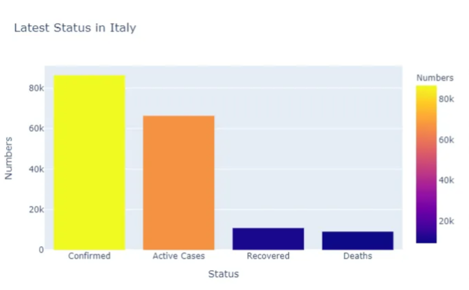
The rate of Active and Recovered Cases are 77% and 13% respectively and the Death rate is also 11% in Italy till 27th March 2020
Let’s check what happened in South Korea
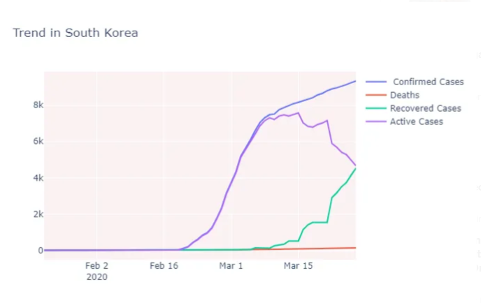
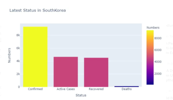
- Confirmed cases have increased from 31 to 602 within 5 days i.e between February 19 and February 24, this may be because of Patient#31 of South Korea (refer to this article to read about this)
- From 15th March rate of confirmation is kind of stable and not increased much as compared to previous weeks
- After 15th March rate of recovery has increased drastically and the number of deaths is less as compared to confirmed cases
The rate of Active and Recovered Cases are 50% and 49% respectively and the Death rate is also 1% in South Korea till 27th March 2020
Like China, South Korea also did a commendable job in controlling this pandemic which is evident with their low death rate but the number of active cases is high which is close to 60%. But unlike Italy, despite of sudden surge in cases, they were able to handle them efficiently.
Let’s list down the points which would be ideal in the current scenario
- The rate of Confirmed Cases should not be increasing drastically
- The rate of Death should be very low
- The rate of Active cases should be gradually decreasing
- The rate of Recovery should be gradually increasing
It’s evident from the above graphs that China and South Korea are exhibiting all these points. Any country who are in the early stages should exhibit these trends to fight against COVID-19
Trends in USA and INDIA
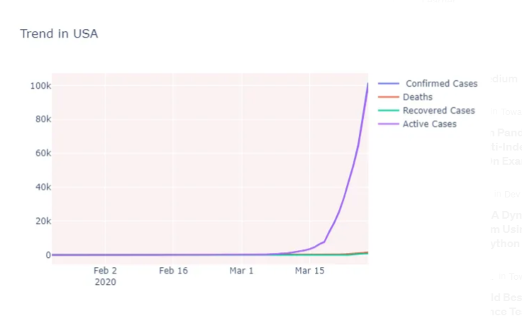
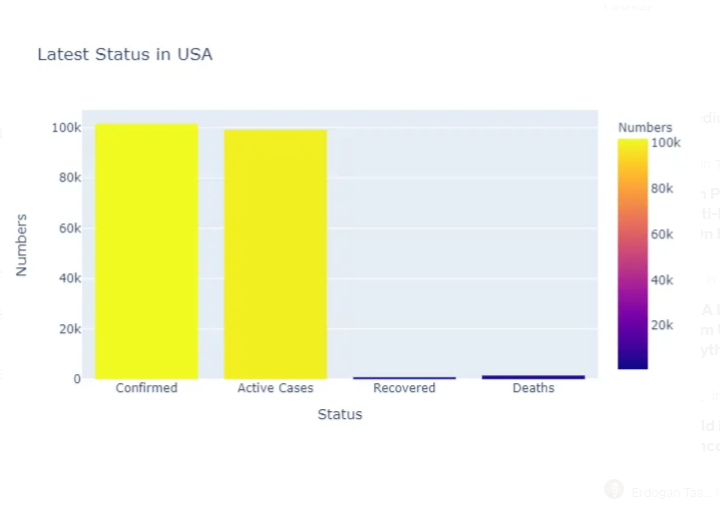
- There is a huge surge in confirmed cases in the US after March 10, cases rises from 267 to 15,793 in 12 days(10 March-22 March)
- Death rates increased drastically from 1 to 117 within 22 days (1 March- 22 March)
- The rate of recovery was kind of flat till 15 March after that it increased
- The majority of cases are still active
The rate of Active and Recovered Cases are 98% and 1% respectively and the Death rate is also 2% in the USA till 27th March 2020
Let’s check about India
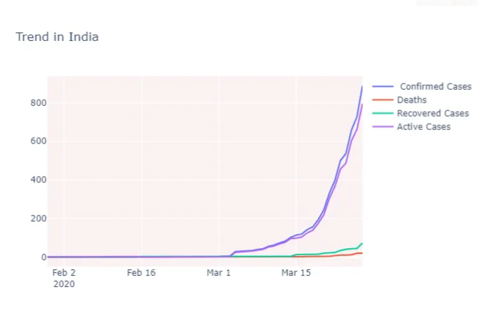
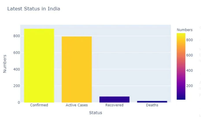
- In India also the number of confirmed cases increased drastically from the first week of March, within 20 days it raised from 5 to 396 (2 March-22 March) but the numbers are significantly low as compared to US
- Death and Recovery rate is relatively low
- India also has huge number of Active cases
The rate of Active and Recovered Cases are 90% and 8% respectively and the Death rate is also 2% in India till 27th March 2020
The USA and India are not doing well in terms of cumulative numbers and graphs, they have a high number of active cases and a low number of recoveries, which is not very encouraging
China, South Korea, and Italy Vs USA and India
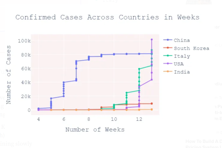
We will compare confirmed cases and Active Cases in these countries across weeks to find out where US and India can land in the upcoming weeks
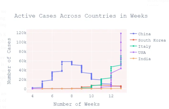
- For China, in initial weeks there is a surge in Confirmed Cases but after 4th week of reporting initial cases(#8 at the x-axis in the above graphs) active cases started reducing
- Similarly, for South Korea after the 4th week of reporting initial cases(#11 at the x-axis in the above graph) confirmed cases are not increasing much, and active cases are declining slowly
- For US and Italy after 7th week of reporting initial cases(#11 at the x-axis in the above graph) there is a sudden surge in confirmed cases and this is rapidly increasing week by week (We can see this by observing each Week Steps Height in the above graphs , which is quite high for US/Italy as compare to China/South Korea)
- As of now numbers are not high in India but here also there is a surge after 7th week of reporting initial cases(#11 at the x-axis in the above graph),this is significantly very less as compared to Italy and US
Last Word
Well, this is evident from the above analysis that China and South Korea can control and tackle COVID-19 efficiently as they have started all their measures early. Their active cases are coming down significantly after the 4th week of initially reported cases.
Whereas Italy and the US are following the Polynomial Regression curve in Confirmed and Active cases which means in upcoming weeks it’s going to increase for sure. There is very little chance of a decline in this curve, especially for the US because there is no complete country lockdown and the US government is only focusing on areas where the number of cases is more.
Also, there was a significant amount of time between the initial cases and the sudden surge (close to 7 weeks) but there were no proper measures and actions during this period and I strongly believe this may be the reason behind the sudden surge because, in absence of lockdown, this time frame is sufficient enough to spread the virus.
As of now, fortunately, this is not happening for India as numbers are still less and if Indians follow 21 days of complete lockdown (starting from 24 March till 14th April) rigorously then the situation could be better, hope for the best.
Thoughts and Prayers with all who are fighting COVID-19 !!
Disclaimer: Just to let you know, this blog post was originally published on Medium. If you’d like to check out the original, you can find it at this link.

Leave a comment